— Seeing results:
Mercedes-Benz Service Center, Moscow.
CLIENT
Mercedes-Benz service center | Moscow.
Client’s overall goal was to understand their needs in creating a professional website/overall concept of web presence.
GROUP
Project Manager
Content Strategist & Copywriter
Marketing Specialist
UX & UI Designer
Graphic Designer
Web Designer
SCOPE
- Competitive environment and target audience Analysis
- Concept Development & Logo redesign
- UX & UI
- Copywriting
- Website Design & Development
- Content Management System
- Tech SEO
DESIGN RESULTS
Compactness vs pro status.
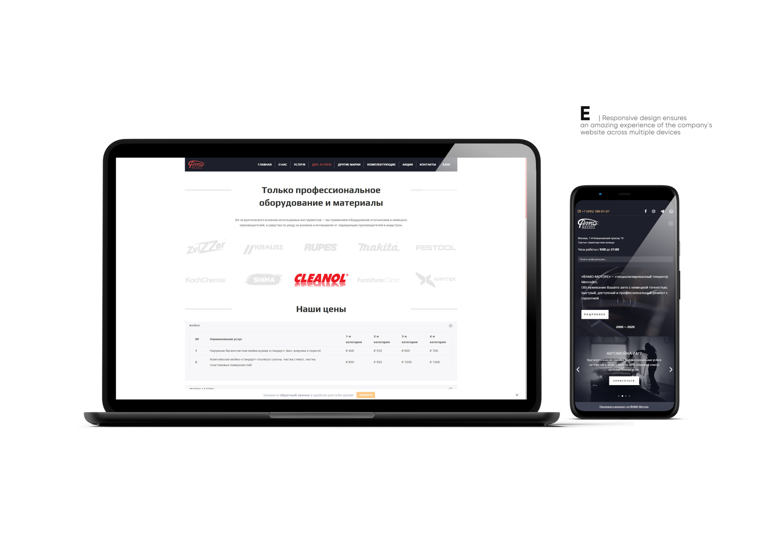
We strategically divided mobile presence and presence on laptop/tablet/personal computer into separate components. What does it mean?
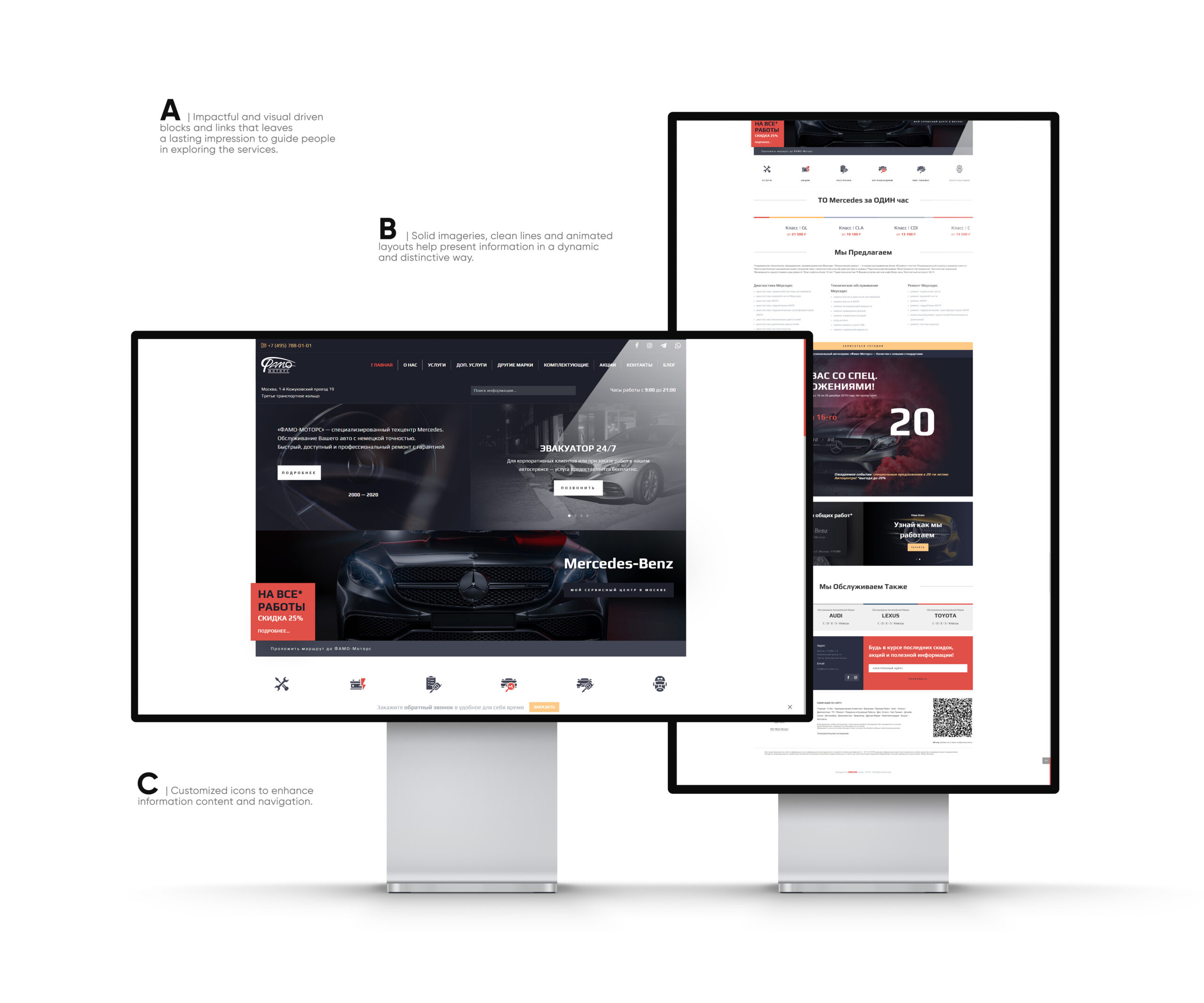
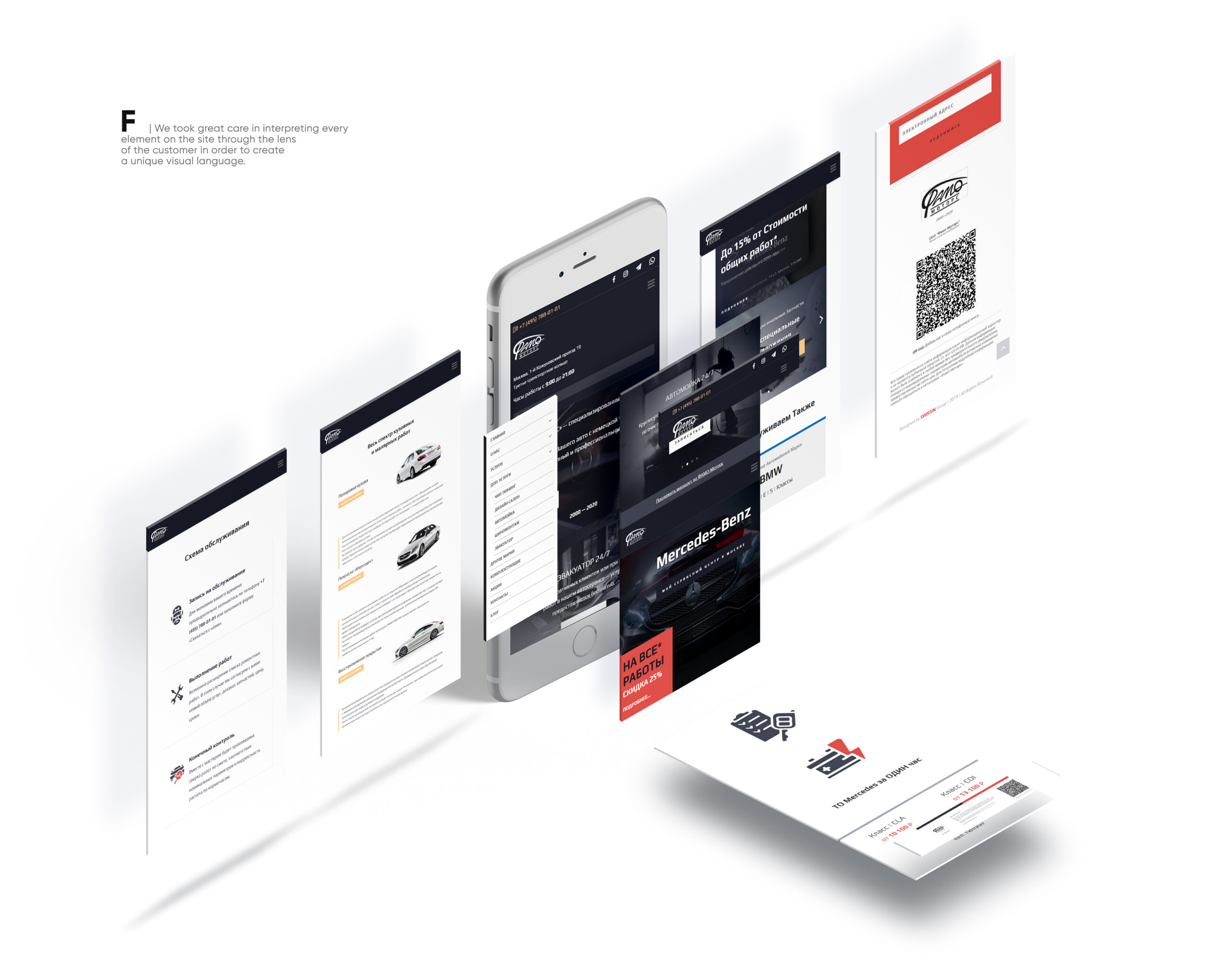
We created the main page of the site – explicitly targeted at mobile users in terms of functionality, looks and design.
Compactness, convenience, minimalism, accessibility of the most critical elements, the right call to action elements – these are not optional characteristics of a modern website – they are a mobile must-have!
Car breakdowns do not always happen when a potential customer is at home and when he could spend hours choosing the right repair station. Often a decision needs to be made quickly, on the road, and, accordingly, the task of the site is to convince the visitor of the correctness of his choice in a few seconds without providing unnecessary information. All the listed properties of UX & UI contribute to this strategic objective.
But what about the additional information, depth and professional look of the site?
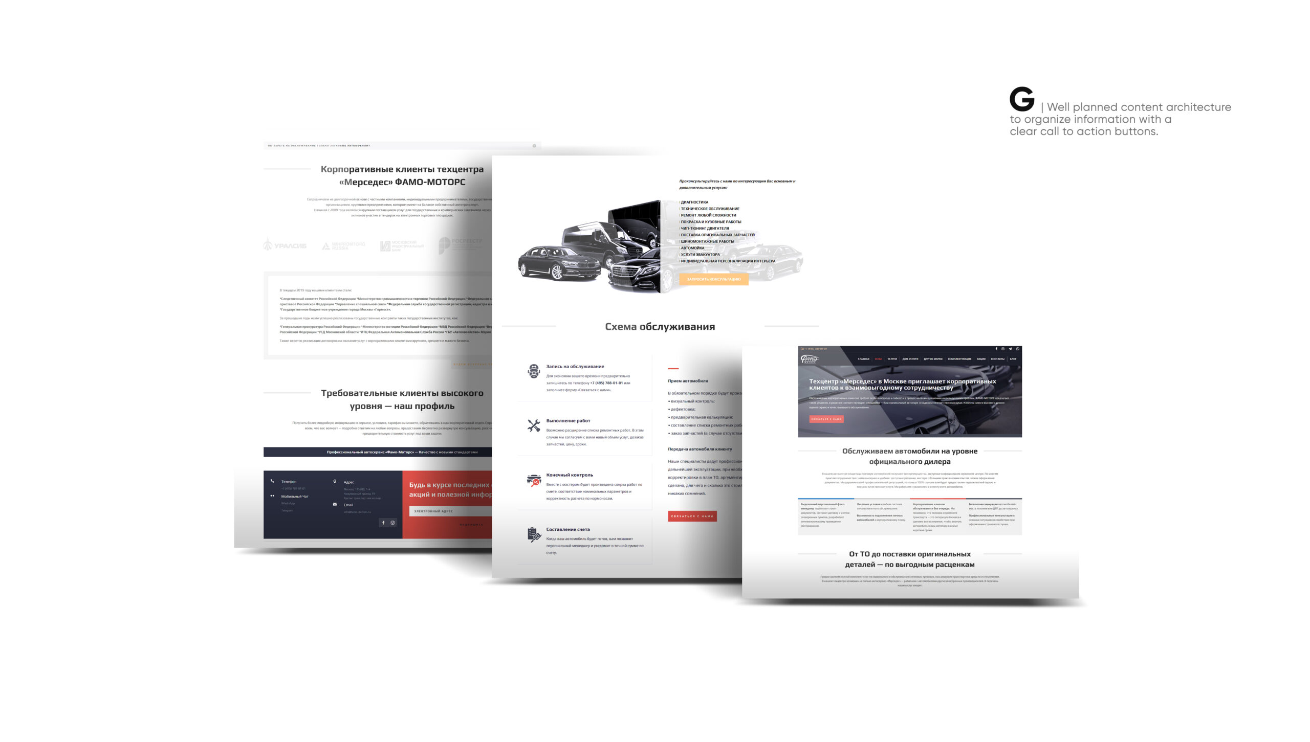
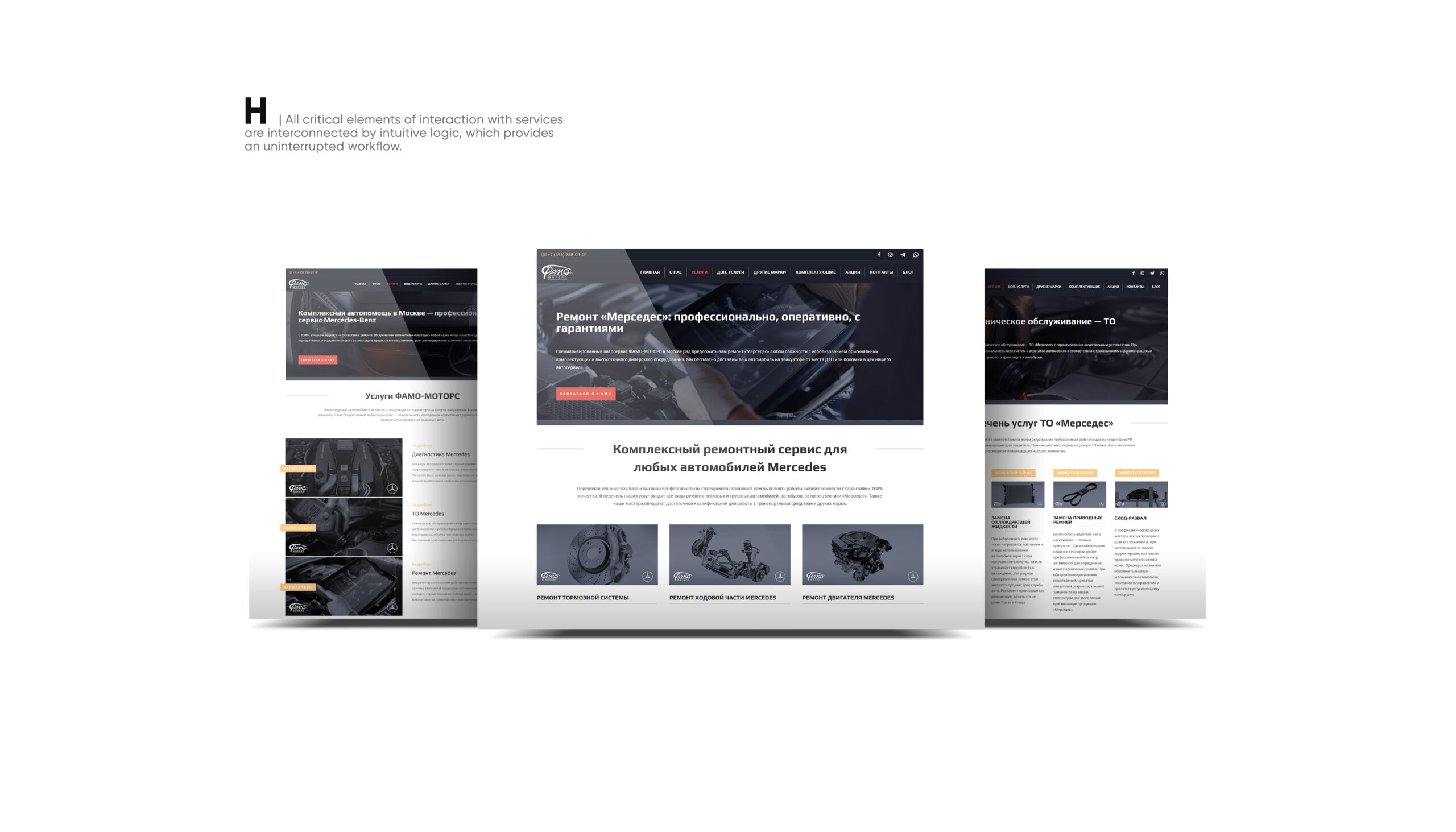
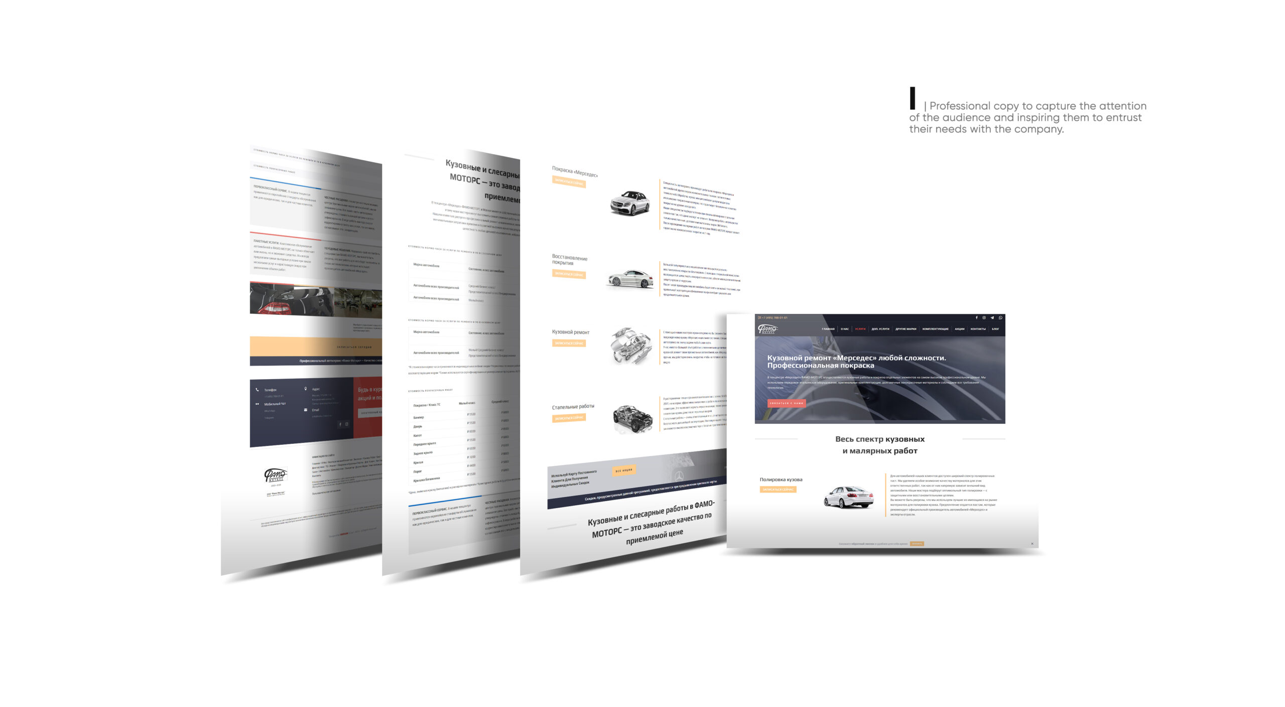
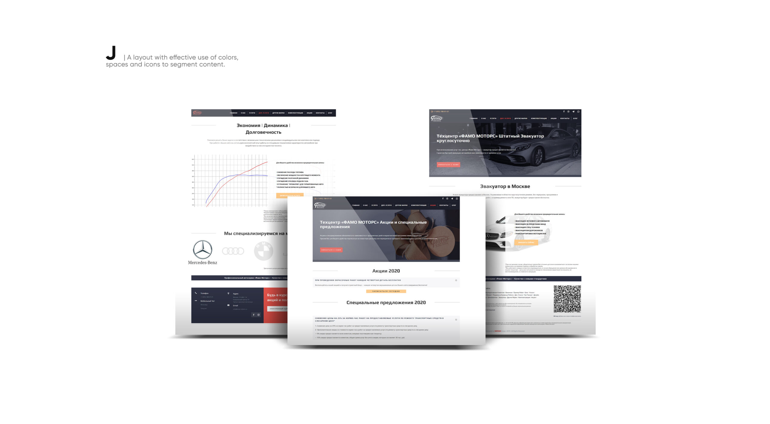
And for this reason, we maximized/increased content on the remaining pages of the site and filled all the pages with corporate-minded copywriting. We included some additional elements in the mobile-oriented home page when the user opens it on laptops/tablets/personal computers.
CREDITS
Agency
SWISSIN GROUP GmbH
the Digital DNA of Marketing